Redesigning for Belonging: UX Discovery Research for the Foundation for Intentional Community UX Research Case Study | TechFleet / Foundation for Intentional Community (IC.org)
The Challenge
The Foundation for Intentional Community (FIC) has been a resource for people seeking cooperative, sustainable living for over 35 years. Their website, IC.org, serves as the primary entry point for people curious about intentional communities — whether they are brand new to the concept, actively searching for a community to join, or already living in one. Despite the depth of resources the site offered, FIC knew something wasn't working. Users were arriving with genuine interest and leaving without understanding what the site had to offer or how to act on it.TechFleet partnered with FIC in November 2024 to evaluate the current site and redesign it. I joined as one of three lead researchers on the UX Research team, the only member with prior industry experience, and co-led the discovery research study while also mentoring five apprentice researchers across the project.
My Role
I served as a lead researcher on a cross-functional team that included UX design, product strategy, UX writing, and project management. On the research side, my responsibilities included reviewing prior research and existing survey data to identify known gaps, co-designing the discovery study with my research co-leads, leading moderated discovery interviews with users, and guiding five apprentice researchers through every phase of the research process — from study planning through analysis and synthesis. The other half of the research team conducted card sorting studies and Google Analytics analysis in parallel, and we synthesized our findings together at the end of each sprint.
What I Did
Before designing the discovery study, I reviewed handoff documents from prior research conducted before Phase 1, as well as existing FIC community surveys. This gave our team a foundation to build from rather than starting from scratch, and helped us identify the specific questions that still needed answering.I then co-designed a moderated discovery study using a discussion guide that moved participants through two experiences: a Figma prototype of a redesigned homepage, and the live IC.org site. By showing both versions, we could directly compare how users responded to the existing site versus a cleaner, more intentional design — and understand what elements of each drove trust, confusion, or engagement. We recruited participants across FIC's three key personas: Newbies, Seekers, and Residents. Five users participated in moderated sessions. I led the interviews, managed the session flow, and coached apprentice researchers on how to observe, take notes, and avoid leading questions. After completing the interviews I led the synthesis process, building affinity diagrams to surface recurring patterns across sessions and translating those patterns into actionable findings for the design team.
What We Found
The most significant finding was one we hadn't fully anticipated: most users — even those who described themselves as interested in intentional community — were conflating "intentional community" with "building community intentionally." They understood the phrase to mean being deliberate about relationships and connection, not living communally with others. This fundamental misunderstanding meant that users arrived at the site with the wrong mental model entirely, and the site did nothing to correct it. This shaped almost every other finding that followed.
Trust and First Impressions
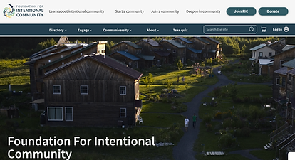
The live site created immediate doubt for users. Two users found the unpolished layout and lack of clear purpose made them question whether it was credible enough to donate to or explore further. Users expected to see personal stories and real community insights — the kind of content that would make the site feel human and trustworthy — and found none of it. One user attempted to interact with the map on the live site's homepage, expecting to click on pinpoints to find community locations, only to discover it was a static image. That moment of broken expectation captured a broader problem: the site promised more than it delivered. The prototype told a different story. When users saw a photograph of a physical homestead, it immediately communicated what intentional community meant in a way that no headline had managed to do. As one participant put it: "It immediately gives me a sense that when you say 'intentional community,' it's not just a digital, online group — this feels tangible and real. It makes me think of a homestead or a supportive physical community." That single image did more explanatory work than the entire homepage text combined.
Navigation and the Quiz
All five users were immediately drawn to a "Take a Quiz" button in the navigation and wanted to click it. Four out of five felt the quiz could help them identify which communities were right for them — essentially acting as a recommendation engine for an unfamiliar topic. Users described it as a way to get direction in a space where they felt lost. As one participant put it: "There's a lot of information here, but answer these simple questions, and we'll show you what you might be interested in." The quiz existed but was not prominent or explained, representing a significant missed opportunity for early engagement and trust-building.
Terminology and Content
Three out of five users were confused by the term "Communiversity" and couldn't determine what it contained or why it was relevant to them. Users also struggled with "Classifieds" and other navigation labels that assumed prior familiarity with the FIC ecosystem. The site spoke the language of insiders to an audience of newcomers. Users also expressed uncertainty about what "member" meant — specifically what benefits membership actually offered — and recommended a clear upfront statement explaining this.
The Directory
Three out of four users encountered difficulties with the directory. Users appreciated the existence of filters but found the advanced search overwhelming. Location consistently emerged as the most important filter — users wanted to search by where they were or where they wanted to be before anything else — but the directory's structure did not prioritize this.
Results
Our discovery findings directly informed the Phase 1 redesign, including a homepage prototype that progressively introduced the concept of intentional community, incorporated real photography of physical communities, and surfaced the quiz as a primary call to action. The research team presented findings at all-hands meetings across sprints, and recommendations were integrated into design decisions in real time. Key recommendations delivered to the design team and client included defining "Intentional Community" clearly and early on the homepage, replacing "Communiversity" with a more descriptive label such as "Learning Hub" or "Community Resources," making the quiz prominent and explaining its purpose upfront, adding testimonials and personal stories for each type of community engagement, clarifying membership benefits explicitly, and prioritizing location as the first and most prominent directory filter.The research also identified a clear agenda for Phase 2: usability testing on the new prototypes, additional qualitative research on the directory, and tree testing to evaluate whether the new navigation labels were working.
What This Demonstrates
This project required navigating the full complexity of discovery research in a volunteer, multi-timezone, cross-functional team environment — managing apprentice researchers, synthesizing data from parallel workstreams, and translating findings into design decisions under real time constraints. The most important insight wasn't about a button or a filter. It was that the site's core communication challenge was conceptual: it assumed users understood what intentional community meant, when most of them didn't. Getting that right was the foundation everything else was built on.